Sunday, 28 December 2014
Tuesday, 16 December 2014
Feedback
Feedback:
‘Good idea
for design with person on front cover facing sideways, it’s different. Good
proposed colour scheme with black and yellow, work well together, stand out.
Might be little a difficult getting the contents design to as Ross has
explained to me. Probably needs some variation in colour within the magazine,
not just yellow and black throughout. But overall good choice for design and
should work nicely’- Mum.
‘Decent
idea, from sounds of it might be a bit hard to pull off. But if done right
magazine could be very good. Good content ideas as well, the explanation of
using a mix of well-known artists and existing artists, colour scheme is to my
taste but does work, think it would have been better if using red instead of
yellow.’- Dad.
‘Really really good design, similar to the design I did at my school for my media project. It’ll work really well especially if exactly, or near enough the same as the placed images he’s told me he’s put place in the magazine at the moment. For my media I used a wider range of colours, so for Ross to expand an make his magazine more interesting he should probably think about using like 3-4 more different colours.’- George.
‘Really really good design, similar to the design I did at my school for my media project. It’ll work really well especially if exactly, or near enough the same as the placed images he’s told me he’s put place in the magazine at the moment. For my media I used a wider range of colours, so for Ross to expand an make his magazine more interesting he should probably think about using like 3-4 more different colours.’- George.
Wednesday, 10 December 2014
Production Diary 10
This week I've been involved in photo shooting for music magazine. I've taken around 20-30 photos, preferably I would have liked to have taken between around 60-80 photos but we ran out of time in our selected period for shooting. The range of photos that I have collected are of a decent quality and have a certain different style to them, meaning they are not all shot from one angle with seemingly the same image being produced every time, but are shot from high angles, low angles, side angles and so on. Further, the positioning of the person(s) in the shoot are different also. They people involved are shot showing side on views, sitting views, stand and laughing views and views integrated with instruments (holding instruments), instruments including bass and acoustic guitars. In addition, the people in the photographs have varied the styled of clothing, not by changing clothing due to having a short period of time, but by taking coats on and off, whilst also swapping coats at times. Even though not ideal it does just add some variety to the images displayed. If added to in another shoot, I would for one change the clothing of the persons taking part, secondly add some sort of technological equipment for example someone wearing headphones at the desk of a computer, and finally change the background of the shoot to outside or in a studio posing next to speakers or something similar. Whilst changing the factors as mentioned, I would also have to liked to of changed the motion of the people being shot, as almost all of the shots are static, but by taking some shots of people in motion the feeling of the magazine could be deemed to be more energetic and fitting for the content within the magazine.
Standard static Imaging: Motion imaging:


Tuesday, 9 December 2014
Production Diary 9
This week I've been planning for my photoshoot. I have managed to obtain a couple of friends who said that they'll happily help and take part. I have managed to get 2 people, ideally I would want to get 4-5 people but for the time being as a starting point, 2 is fine. I have been thinking of ideas for the way in which my participants could models themselves in different positions and stances for the shoot. I have a vahue idea of how I would like them to be shot, obviously most of my shots will be with them in static positions (no movement), but in order to progress and make my images stand out I would like to attempt motion imaging, where the people in the photographs give the impression to be moving and applying themsevles actively, whether that be playing an instrument, being at a computer typing or interacting with another person, for example putting a hand on the shoulder, laughing or pretend fighting. Also this week, I have managed to finish the majority of my magazine, obviously excluding the photos that I will take. Most of the text for my feature article is complete and alongside this are place holder pictures I have gathered off of the internet. The pictures I have chosen for my place holder pictures are similar to that of the pictures I feel I would like to use myself, meaning I would like to emulate the way in which the images are taken and the way that the musicians stand and such.
Photoshoot Ideas:


Photoshoot Ideas:
Monday, 8 December 2014
Sunday, 7 December 2014
Social Media
How to contact us:
Twitter- @powermag -This is the account we tweet through and if you wish to ask any questions
- @PM10- This is the account to send us any suggestions for new articles aswell as informations on new artists, this includes artist profiles, songs and anything else
Youtube- PMchannel10
Facebook- Powermag- This our generic Facebook profile, which acts as questions centre and a place where we post videos and podcasts
- @More_Power- This Facebook group is for events held by us or any of our associates, additionally this group is more for our subscribers as there are specialist giveaways and articles made for these readers
- @More_Power- This Facebook group is for events held by us or any of our associates, additionally this group is more for our subscribers as there are specialist giveaways and articles made for these readers
Twitter- @powermag -This is the account we tweet through and if you wish to ask any questions
- @PM10- This is the account to send us any suggestions for new articles aswell as informations on new artists, this includes artist profiles, songs and anything else
Youtube- PMchannel10
Instagram- @mag_power10
Number- 07856319904
Fax- 07857778502
Email- power.magazine10@gmail.com
Flickr- POWER_10
Promotional Methods
I order to make my magazine more appealing, I shall include free giveaways, things such as tickets to concerts, holidays, game consoles, clothing and albums.
List of possible giveaways:
1. Tickets to Disclosure at Brixton academy
2. A Supreme hoodie and a choice of 3 supreme baseball caps
3. A holiday away to Ibiza
4. A holiday away to Malaysia
5. A PS4 with a bundle of 3 games (Destiny, Fifa 15, Call Of Duty)
6. 'Darwin's' hit new album 'Illusions'
7. Tickets to underground village in Shoreditch, London
8. A chance to meet Kanye West at the unveiling of his new clothing range in New York
Competitions:
1. Name the artist- Half covered up picture of an artist
2. What is 'Jay-Z's' real name?
A- Shawn Carter
B- Steve Carter
C- James Carte
3. In Darwin's new album 'Illusions' which two songs were recently mentioned as "Best dance tracks ever" by Radio 1's Nick Grimshaw?
4. What are the next lyrics 'Latch' by Disclosure?
"Now I've got you in my space, I won’t let go of you, Got you shackled in my embrace.....................................
A- I'm gonna latch onto you
B- I'm latching onto you
C- I will latch onto you
5. For a chance to win a trip to New York sketch or photograph an album cover for Kaytranada's new single 'Journey'. The winner will be announced on our website on the 15th January
6. Back in August, Sam Smith announced he will be collaborating with.............on a full album in the new year. Who is that artist?
A- Naughty Boy
B- David Guetta
C- Mr Carmack
D- Emeli Sande
E- Calvin Harris
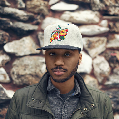
7. In order to win a supreme hoodie and a choice of 3 Northface baseball caps (as pictured below), create a full detailed artist profile, this artist may be fictional or nonfictional, and which ever one we believe to be the best will win the prize. The winner will be announced on our website on the 15th of January.
Name ideas and explanations
1. Power
2. Spark
3. Bass Mode
4. Club
5. Electric Sound
6. Bouncin'
7. Overload
8. Record
9. Smash
10. Universal Sound
Reasoning behind a few of the names:
1. Power- This is the final name I have chosen to use for my music magazine. This name signifies many things. Power can be interpreted as being strong, bold, alive (energetic) and supreme. The feeling for the reader after buying 'Power' magazine is supposed to be one of uplifting self-morale and confidence, hence the name. By feeling this the readers will seemingly be more inclined to regularly buy the magazine due to the feeling they have gained previously. Further, in comparison to my other name choices this one, for me, fitted better in relation to my genre of music.
9. Smash- This was my second final choice for my music magazine. This much like 'Power' is a bold upfront type of name, but on the other hand, it seemed more aggressive and had a more negative edge to it, as it could've been seen to be representative of say a punch or something breaking. In relation to my genre of music for the magazine, the name 'Smash' could mean a break through in music, hard hitting new music or an alternative more unorthodox way of looking at music.
10. Universal Sound- This was my third final choice for my magazine. Out of all my name choices even though I ultimately prefer 'Power', this name has the most friendly tone and for a wider audience seemingly would be more fitting. But unlike my final chosen name, this one is more open to all genres of music from an outside point of view, whereas 'Power' you can see that it's probably going to be affiliated more with dance/energetic music, whereas 'Universal Sound' sounds as if it refers to lots of genres from all over the world.
Thursday, 27 November 2014
Draft of Feature Article- "Darwin's Theory"
"So, how long have you been making music for? Well...I've gone through ten speakers, 3 computers and listened to over 300 albums...that's how long." These are the words of one of the hottest new acts rising up through the ranks of the dance scene. Ryan Cowling or better known as 'Darwin', is one of house's bright young talents, hoping to break through and take the world by storm. Born in south east London and son of two musicians, Cowling has always been surrounded by music. From a young age Ryan has always been known by his relatives as a 'music maestro'. When asked, his mother said "right from the off, Ryan has constantly been hitting something, tapping something and just generally been making a racket." Well at least for Ryan's mum's sake all those years of broke piano keys and neighbour complaints finally have paid off. Due to his dad's influence, at the age of 8 Ryan began playing the guitar. Being the lead guitarist of the prog rock band 'The Locals' Cowling's dad was more than happy to give Ryan a push in the right direction. From there, Ryan took up interest in the drums, the piano and the clarinet, and by age 13 could practically form his own band. At 14, Cowling began to take an interest in dance music. Through this spontaneous uptake, for his 15th birthday his parents bought him a set of numark dj decks. From this point on Ryan's, or now Darwin's life would never be the same. With this new found style, came a new name. At first Ryan would have a few friends over and they would mess around blending all sorts of pop hits with no serious intention, but as soon as Cowling found drum and bass, things began to get real. One of Ryan's good friends introduced him into one of the pioneers of drum and bass. 'Goldie'. Once introduced, there was no going back. Cowling said "after I heard just 2 of his songs, I ran home and begged my parents for music making software." On Cowling's 16th birthday he was presented with 'Reason' (a top brand music making software). With this Ryan was unstoppable, he was blasting out tunes left, right and centre, he changed his clothing style, his lingo and most importantly...his name. When questioned about his name, Cowling replied "Darwin, like the evolutionist, you know. Darwin was revolutionary to the theory of life, and like him I'm going to be revolutionary to the theory of music." Now, being signed with 3 Beat Music (an independent British house label), having a hit number one on 'Electric Sound Radio', which subsequently was played on Annie Mac's earlybird mix back in July, and having a regular slot at Mile End's Boiler Room all at the age of 19, is truly remarkable. Who knows, maybe Darwin's the answer everyone's been looking for?
Wednesday, 19 November 2014
Sunday, 2 November 2014
Production Diary 8
Examples of Mastheads:


The Use Of Colour:
These three examples of masthead are resemblant of what I have planned for my own magazine title style. The overall colour theme for these three is the use of a colour onto a plain white background. By doing this, the magazine becomes very diverse as no matter what colour is used, once placed onto a white background the magazine (especially the title) is made to look bold and very prominent. Further, in relation to the other colours used on the front cover (when using a white backdrop) all the colours can be differentiated from each other, rather than using a specific background colour which inturn could mean either the foreground colours collide or get lost when mixed together.
Saturday, 1 November 2014
Production Diary 7
Now that I have chosen the name for both the magazine and name for the main article artist, I am now deciding on what style to present these names/titles in. I have researched many different styles. Through "style", colour and masthead type is included, for example; dark blue with the same style as kerrang magazine.
Colours:
For the magazine title colour I will use quite bright colour in order to grab the reader's attention, not only this but to also resemble the genre of music the magazine is about. Due to the magazine being about dance music which is an energetic style, the colour will consequently let the viewer recognise what the magazine represents. I will also use bright colours/ a bright colour to stand out from the imagery in the backdrop. I have thought about using yellow, bright purple, light green, or yellow and black together. Another reason to why the colours will be bright and such is because through the title "POWER" the colours must be representative of the title, or what the title intends to represent.
Masthead Type:
This week I have been looking at different magazine masthead types, and the affect they have on the reader. In order to fulfil it's purpose the title must be very bold. I'm not going to use too much complex styled font, this is as I intend to make the title look very clear, and by making the masthead different (like kerrang) the reader's eye may be taken off of the title itself and more focused on how the title is presented. Magazines I've been looking at are: "Total Film", "Vibe" and "Blender". These mastheads are bold and allow the viewer to clearly see not only the name of the magazine, but what the magazine symbolizes if there is a specific meaning.
Friday, 31 October 2014
Production Diary 6
This week I have been contemplating names for my magazine and artist names for the main article artist.
Name of magazine:
For the name of the magazine I had 3 main ideas: POWER, Spark, Radio Rental. I chose "Power" for the name of my magazine, with this name in mind I did play with idea of adding "The" at the beginning of the word "POWER" but after having time to think I chose not to do this, this is as the word "POWER" alone is more bold and clear. Plus, using only one word is more likely to stick with people and be more remembered. Other magazines have done this before and have become very successful, such as "Vibe", "Kerrang" and "Clash".
Name of main article artist:
For the artist name I also had main ideas, after cutting down a few names I came down to two main ones: Darwin and Rambo. In the end I chose "Darwin", I chose this name as even though "Rambo" sounds quite tough and fierce, I chose "Darwin" in connection to Charles Darwin. I did this to make it seem, or give the impression that this artist in the main article is a pioneer/revolutionary figure in relation to new music, much like Charles Darwin to the theory of evolution.
Wednesday, 22 October 2014
Wednesday, 15 October 2014
Saturday, 11 October 2014
Friday, 10 October 2014
Production Diary 5
This week I've been looking at music videos trying to identify which ones I think have really good styles for me to use for my music magazine. Whether that be the use of text or possible shots I could use for the photoshoot. Whilst looking through music videos I found one particular video in which I thought was especially apparent when looking at shots for my photoshoot. This music video was "Thank You" by Busta Rhymes. The video uses a certain shadowed effect, this effect made me consider using this style for my music photoshoot, for the main article story inside the magazine. Eventhough I want to use bright colours for the front cover, I think contrasting the colours for different sections of the magazine creates a unique style, which inturn will hopefully make my magazine stand and have a different feel.
https://www.youtube.com/watch?v=QhIrzbhEGvs- This is the link to the video.
Some shots used in the video:

As mentioned these shots have a certain shadowed effect, alongside coloured lighting. These effects make the rappers in the shot more prominent and bold. Further, a new perspective is given to the people in the video unlike most music videos where the people are usually seen in just one light, which is standard and uninventive.
https://www.youtube.com/watch?v=QhIrzbhEGvs- This is the link to the video.
Some shots used in the video:
As mentioned these shots have a certain shadowed effect, alongside coloured lighting. These effects make the rappers in the shot more prominent and bold. Further, a new perspective is given to the people in the video unlike most music videos where the people are usually seen in just one light, which is standard and uninventive.
Thursday, 9 October 2014
Monday, 6 October 2014
Production Diary 4
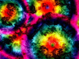
Like I wrote in my previous production diary I shall be making a post in the near future with scanned designs on there with a step-by-step walk through of colour schemes I am going to use, the style of magazine, type of font and so on. In this production diary I have chosen to display the colour style I intend to use for my music magazine. For the type of colour style I am planning to use I am going to use a psychedelic theme. With a mix of bright colours the magazine with become more enticing, and more pleasant to look at. Further, this particular design differs from the norm of magazine production, which in turn should also make the readers more engaged as it is unusual, giving the magazine a different feel.
Psychedelic Colours:
Psychedelic Colours:


Saturday, 4 October 2014
Production Diary 3
So far I have uploaded my contents page and front cover for my haydon school magazine, I have also uploaded analysis for contents pages and front covers, I've presented this analysis through powerpoint in order to make it clearer for onlookers, whilst at the same time showing my intentions for the design of my music magazine. I now must start the plans for my music magazine, I will draw plans for my design, scan them and then upload them onto my one of my next posts . For my design I intend to use a fairly bright colour scheme, alongside very bold but yet minimal text.
I have been searching for different styled font in which I could potentially use for my music magazine. I have chosen 3 styles that I particularly like, these styles include:
 Pacifico.
 Lobster.
 Amatic.
I have chosen these 3 styles as possible font choices as they have a unique style to them which stands out from the rest of the other fonts. By using a unique style, the reader is more inclined to want to read on as there is a new concept that hasn't been seen before. Eventhough I previously mentioned in this post I want to use bold font, I have chosen the bottom one as it is similar to everyday handwriting, this can mean it's more realteable to the readers.
I have been searching for different styled font in which I could potentially use for my music magazine. I have chosen 3 styles that I particularly like, these styles include:
I have chosen these 3 styles as possible font choices as they have a unique style to them which stands out from the rest of the other fonts. By using a unique style, the reader is more inclined to want to read on as there is a new concept that hasn't been seen before. Eventhough I previously mentioned in this post I want to use bold font, I have chosen the bottom one as it is similar to everyday handwriting, this can mean it's more realteable to the readers.
Thursday, 2 October 2014
Wednesday, 24 September 2014
Production Diary 2
After finishing my Haydon magazine I am now onto starting my planning for the music magazine. I have made a powerpoint on my ideas and thoughts on how I will present my magazine, also in the powerpoint I have analysed the colour schemes, fonts, imaging and designs for some of the magazine covers I have hoped to follow in order to create my piece. I've decided to take the approach for my design of that of the magazine "CLASH". Clash uses close up imaging as well as bold colourful fonts. I find Clash to be very unique as unlike my magazines there is minimal text and usually very few topics shown on the front cover, on most magazines there are multiple stories, lots of texts and in some cases multiple font use.
Clash magazine designs:
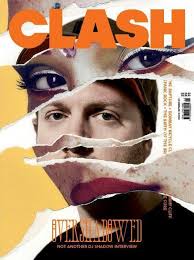
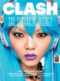
Clash magazine designs:
Evaluation
I have now finished my haydon magazine. The final product was not as I had fully intended but I am still happy with what I have produced. I believe my skills with the software used to make the magazine have improved drastically since the start, I am still not one hundred percent confident on the software but I have grasped the basics and generally know how to put the software into practice. This includes placing photographs, creating texts borders and changing the fonts and colours of the texts. My creative ideas changed for my final design, I chose a different front cover photo, whilst at the same time changing the colour scheme to only dark blue and white opposed to my original idea of using red aswell. I chose to change the colour scheme to only blue and white for consistency so when the reader looks at the magazine everything flows and their eye isn't bombarded by an array of colours. I used two thumbnails unlike my design ideas which only had one thumbnail. Further, I didn't use the text borders I had intended to use, this is due to my lack of knowledge and ability on the software, I therefore didn't use any borders and let the text sit freely. I used the font I wanted to use for the magazine title, I continued this style of font for the rest of the of the text on the front of the magazine. I did this for the same reason I made the colour scheme all the same, for consistency and look better on the page, unlike if there were to be multiple fonts which would make the text look uncomfortable/out of place when placed together on the page. For the contents page the idea was kept from my design plans, but the shadow effect was not used and the background colour fades from white into black unlike my plans which just had a plain white background. The pictures I used at the bottom of the page were as I had imagined. In conclusion, I am pleased with my final magazine product and with extended use of the magazine making software I will gain experience and become more adapt meaning I will be better at using the program, which will be beneficial to my music magazine project.
Analysis of students work
I have chosen the work of Amy Wichelow to analyse. I think her work I very colourful, imaginative and interesting. Her front cover is very bold, with a close up to a girl's face whilst also using bold text and a variation of text design. She has been creative as in the bottom right corner she has used the effect to seem asthough the page is turning, in order to entice you to read on. Her contents page is also good as there is a range of pictures, and items clearly labeled. The only criticism I would give for the contents page is that the wording is small and quite compact, meaning it could be difficult to follow and less interesting to read. Throughout she uses many pictures to draw the reader's eye, she also uses quotes in her text which is allows the stories in the magazine to have a deep context. There is a fair amount of text variation throughout, she uses some bold lettering especially for quotes where she makes the text very bold and colourful to contrast to the normal smaller thin text. Overall, I would say her work is of a very high standard which not only uses pictures to tell the stories but a wide variety of textual methods aswell.
http://issuu.com/haydonmedia/docs/finalone____?e=7172892/1668930
http://issuu.com/haydonmedia/docs/finalone____?e=7172892/1668930
Production Diary 1
So far I have completed my front cover for the preliminary Haydon magazine task. The final design and layout for the front cover was not exactly how had I planned in relation to my sketches (which can be seen in one of my other post). Eventhough the final product was not exactly the same as my sketch ideas I am still happy with the design and think it fits better than my sketch design would. The text and colour scheme is how I had imagined. I am yet to complete my contents page but will be finishing that in the near future. I believe my progress to be going at a good pace, and I have some good ideas for the next magazine task, I will be making a post much similar to that of the Haydon magazine designs, but on the music magazine. In that post I'll include the text I will hope to be using, the pictures to use, the colour scheme, the contents page and other aspects of the magazine. My next tasks will be to finish the contents page of the Haydon magazine and to look at starting the design for the music magazine.
Most likely design to use for my music magazine:

Most likely design to use for my music magazine:
Thursday, 11 September 2014
School magazine cover and contents
The magazine heading I have chosen is "The Haydon Weekly". The heading will have a colour display of dark blue and white, "Haydon" will be in thick bold letters whereas "weekly" will be in thin letters, "weekly" will also have a shadow effect. I have chosen to use dark blue and white to be in keeping with the traditional colours of the school. I intend to have a photograph taken from the camera of a puzzle piece with the word excellence centered on it. On the right of the photograph will be a mid-shot of someone taken from the camera with the words "Bright Future for Young Footballer" underneath in thin dark blue lettering, similar to the heading. Apart from the word "Haydon" all written words will be in Arial font. On the left of the main centered photograph will be "DRAMA" written down the side of the page, underneath this will be the words "New&Improved" in thin text. "DRAMA" will be coloured with white and "New&Improved" in dark blue, similar to the heading. Underneath the centered photograph will be (in bold) the words "STATE OF THE ART", this text will be embedded in a star-like frame. The background for the star-like frame is going to be white, and the text "STATE OF THE ART" will be in dark blue, much like the heading. Right under the star-like frame are going to be the words "more inside" in small capital letters, on the right will be an arrow facing right to indicate to turn the page. "More inside" alongside the arrow will be coloured in dark blue.
On the inside of the main cover page is going to be the contents page. The stories i have chosen include sports related events, educational excellence awareness and new tips to start the school day off right. At the top of the page will be the word "contents" the text will be in exactly the same style as "weekly" on the front cover, dark blue text with a shadow effect. I have choosen 6 stories to go on the contents page, each title will be styled the same with the first letter in capitals with a shadow effect similar to the contents title at the top of the page. The style of letters will be the same as the contents heading, with thin dark blue lettering. Next to the story titles will be full stops contiuing to near the edge of the page, at the of the full stops will be page numbers in relation to where the stroies would be in the magazine. The page numbers will be in line, therefore the full stops will vary in relation to the length of the stories title. Underneath the contents story headings will be 3-4 pictures in connection to the contents stories, for example pictures of football, a construction site etc.

On the inside of the main cover page is going to be the contents page. The stories i have chosen include sports related events, educational excellence awareness and new tips to start the school day off right. At the top of the page will be the word "contents" the text will be in exactly the same style as "weekly" on the front cover, dark blue text with a shadow effect. I have choosen 6 stories to go on the contents page, each title will be styled the same with the first letter in capitals with a shadow effect similar to the contents title at the top of the page. The style of letters will be the same as the contents heading, with thin dark blue lettering. Next to the story titles will be full stops contiuing to near the edge of the page, at the of the full stops will be page numbers in relation to where the stroies would be in the magazine. The page numbers will be in line, therefore the full stops will vary in relation to the length of the stories title. Underneath the contents story headings will be 3-4 pictures in connection to the contents stories, for example pictures of football, a construction site etc.

Subscribe to:
Posts (Atom)