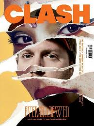
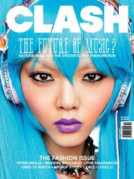
After finishing my Haydon magazine I am now onto starting my planning for the music magazine. I have made a powerpoint on my ideas and thoughts on how I will present my magazine, also in the powerpoint I have analysed the colour schemes, fonts, imaging and designs for some of the magazine covers I have hoped to follow in order to create my piece. I've decided to take the approach for my design of that of the magazine "CLASH". Clash uses close up imaging as well as bold colourful fonts. I find Clash to be very unique as unlike my magazines there is minimal text and usually very few topics shown on the front cover, on most magazines there are multiple stories, lots of texts and in some cases multiple font use.
Clash magazine designs:
I have now finished my haydon magazine. The final product was not as I had fully intended but I am still happy with what I have produced. I believe my skills with the software used to make the magazine have improved drastically since the start, I am still not one hundred percent confident on the software but I have grasped the basics and generally know how to put the software into practice. This includes placing photographs, creating texts borders and changing the fonts and colours of the texts. My creative ideas changed for my final design, I chose a different front cover photo, whilst at the same time changing the colour scheme to only dark blue and white opposed to my original idea of using red aswell. I chose to change the colour scheme to only blue and white for consistency so when the reader looks at the magazine everything flows and their eye isn't bombarded by an array of colours. I used two thumbnails unlike my design ideas which only had one thumbnail. Further, I didn't use the text borders I had intended to use, this is due to my lack of knowledge and ability on the software, I therefore didn't use any borders and let the text sit freely. I used the font I wanted to use for the magazine title, I continued this style of font for the rest of the of the text on the front of the magazine. I did this for the same reason I made the colour scheme all the same, for consistency and look better on the page, unlike if there were to be multiple fonts which would make the text look uncomfortable/out of place when placed together on the page. For the contents page the idea was kept from my design plans, but the shadow effect was not used and the background colour fades from white into black unlike my plans which just had a plain white background. The pictures I used at the bottom of the page were as I had imagined. In conclusion, I am pleased with my final magazine product and with extended use of the magazine making software I will gain experience and become more adapt meaning I will be better at using the program, which will be beneficial to my music magazine project.
I have chosen the work of Amy Wichelow to analyse. I think her work I very colourful, imaginative and interesting. Her front cover is very bold, with a close up to a girl's face whilst also using bold text and a variation of text design. She has been creative as in the bottom right corner she has used the effect to seem asthough the page is turning, in order to entice you to read on. Her contents page is also good as there is a range of pictures, and items clearly labeled. The only criticism I would give for the contents page is that the wording is small and quite compact, meaning it could be difficult to follow and less interesting to read. Throughout she uses many pictures to draw the reader's eye, she also uses quotes in her text which is allows the stories in the magazine to have a deep context. There is a fair amount of text variation throughout, she uses some bold lettering especially for quotes where she makes the text very bold and colourful to contrast to the normal smaller thin text. Overall, I would say her work is of a very high standard which not only uses pictures to tell the stories but a wide variety of textual methods aswell.
http://issuu.com/haydonmedia/docs/finalone____?e=7172892/1668930
So far I have completed my front cover for the preliminary Haydon magazine task. The final design and layout for the front cover was not exactly how had I planned in relation to my sketches (which can be seen in one of my other post). Eventhough the final product was not exactly the same as my sketch ideas I am still happy with the design and think it fits better than my sketch design would. The text and colour scheme is how I had imagined. I am yet to complete my contents page but will be finishing that in the near future. I believe my progress to be going at a good pace, and I have some good ideas for the next magazine task, I will be making a post much similar to that of the Haydon magazine designs, but on the music magazine. In that post I'll include the text I will hope to be using, the pictures to use, the colour scheme, the contents page and other aspects of the magazine. My next tasks will be to finish the contents page of the Haydon magazine and to look at starting the design for the music magazine.
Most likely design to use for my music magazine:
The magazine heading I have chosen is "The Haydon Weekly". The heading will have a colour display of dark blue and white, "Haydon" will be in thick bold letters whereas "weekly" will be in thin letters, "weekly" will also have a shadow effect. I have chosen to use dark blue and white to be in keeping with the traditional colours of the school. I intend to have a photograph taken from the camera of a puzzle piece with the word excellence centered on it. On the right of the photograph will be a mid-shot of someone taken from the camera with the words "Bright Future for Young Footballer" underneath in thin dark blue lettering, similar to the heading. Apart from the word "Haydon" all written words will be in Arial font. On the left of the main centered photograph will be "DRAMA" written down the side of the page, underneath this will be the words "New&Improved" in thin text. "DRAMA" will be coloured with white and "New&Improved" in dark blue, similar to the heading. Underneath the centered photograph will be (in bold) the words "STATE OF THE ART", this text will be embedded in a star-like frame. The background for the star-like frame is going to be white, and the text "STATE OF THE ART" will be in dark blue, much like the heading. Right under the star-like frame are going to be the words "more inside" in small capital letters, on the right will be an arrow facing right to indicate to turn the page. "More inside" alongside the arrow will be coloured in dark blue.
On the inside of the main cover page is going to be the contents page. The stories i have chosen include sports related events, educational excellence awareness and new tips to start the school day off right. At the top of the page will be the word "contents" the text will be in exactly the same style as "weekly" on the front cover, dark blue text with a shadow effect. I have choosen 6 stories to go on the contents page, each title will be styled the same with the first letter in capitals with a shadow effect similar to the contents title at the top of the page. The style of letters will be the same as the contents heading, with thin dark blue lettering. Next to the story titles will be full stops contiuing to near the edge of the page, at the of the full stops will be page numbers in relation to where the stroies would be in the magazine. The page numbers will be in line, therefore the full stops will vary in relation to the length of the stories title. Underneath the contents story headings will be 3-4 pictures in connection to the contents stories, for example pictures of football, a construction site etc.