Friday 8 May 2015
Thursday 23 April 2015
Friday 17 April 2015
Wednesday 15 April 2015
Friday 3 April 2015
Saturday 21 March 2015
Monday 16 March 2015
Sunday 15 March 2015
Saturday 14 March 2015
Friday 13 March 2015

Thursday 12 March 2015
Tuesday 10 March 2015
Thursday 26 February 2015
Evaluation Plan (Part 2)
4. Who would be the audience for your media product?
- From an overview my audience would be that of young people, more specifically mid-late adoloescents.
- There is no specific gender in which my magazine is intended for, in this m magazine will not seem controversial, further, in sales my magazine would generate far more money as there would be twice the amount of peole buying my magazine rather than if there was only one gender buying.
- Plus, only selling to one main gender would restrict productivity in my magazine as it would become labelled meaning it would be able to grow as a brand.
- Without trying to seem arrogant my magazine would most likely appeal to people of middle-upper class. Not dismissing people of lower-class as they would be more than welcome to buy my magazine but through presentation and fashion used by artists it would seemingly not be suited to them.
5. How did you attract /address your audience?
- In order to add real insentive for my readers, I have implimented prizes for competitons, for example winning a trip to another country or winning clothes. The clothes idea I found to be fairly crucial as my magazine has the intention to be quite fashionable, and the youth reading my magazine will most likely as it were 'be in the know' fashion wise, therefore this aspect will or should appeal to them.
- To attract my audience I have used a contrast in colours. I have used a vibrant explosive yellow as well as using a black to compliment it. Using yellow as a main colour hopefully should engage the reader's eye and stand out.
- To relate to new media devices, I have expanded my magazine on to multiple media sources, for example through instagram, twitter, facebook and through the use of an app also.
- My use of expanded media is in keeping with the uses and gratifications theory. This is as all of the media sources I have placed 'POWER' magazine in/onto are all for audience manipulation, meaning the audience have the ability to explore and investigate everything about 'POWER' on their own accord.
6. What have you learnt about technologies from the process of constructing the product?
- In order to produce my magazine I used the software 'Adobe InDesign'. This software allowed me to formulate and edit my magazine, whilst also giving it a professional feel/look.
- To capture my photographs I used a canon camera, for me this camera was great insight into new technologies, as it showed me how indepth and detailed production can be in the modern era.
- During the use of the camera, postioning and lighting became two major factors. Positioning in relation to this camera was very good as the camera was dynamic and diverse allowing me to take quality images from a wide range of different angles.
- For my final product I did use photoshop as I felt my photos would stand out greater with added effects. Photoshop as a software itself is very useful as it has a large library of devices in which one can enhance their work a great deal. Features; include effects...........
- InDesign I found to be of great use. The amount resources within the programme is outstanding. I used my techniques during the process of creating my magazine. These techniques included
7. Looking back at your preliminary task, what do you feel you have learnt in the progression from it to the full product?
- Since starting on my magazine I have gathered many technical skills
- When first approaching my school magazine task, I was skeptical about how to make the magazine detailed and how to make it stand out.
- I did however gather the basics of the program and simple conventions of magazines. For example in the school magazine on the front cover I used a bold main title and used thumbnails for other articles.
- However for the contents page, the layout was very basic and lacked character. As I used a non-appealing font alongside few pictures.
- In comparison to my music magazine the 'Haydon Weekly', looks under developed and weak.
- Through the extensive use of 'InDesign' and teacher discussion, I have managed to understand techniques and features to add to my projects in order to improve them, therefore the reasoning behind why my music magazine is so much more detailed and bolder than my original school magazine.
Original School Magazine:
New Music Magazine:
Wednesday 25 February 2015
Evaluation Plan (Part 1)
1. In what ways does your media product use, develop or challenge forms and conventions of real media products?
- Resemblant of the genre "Dance" music, my magazine uses bright colours much similar to that of everyday music magazines
Example: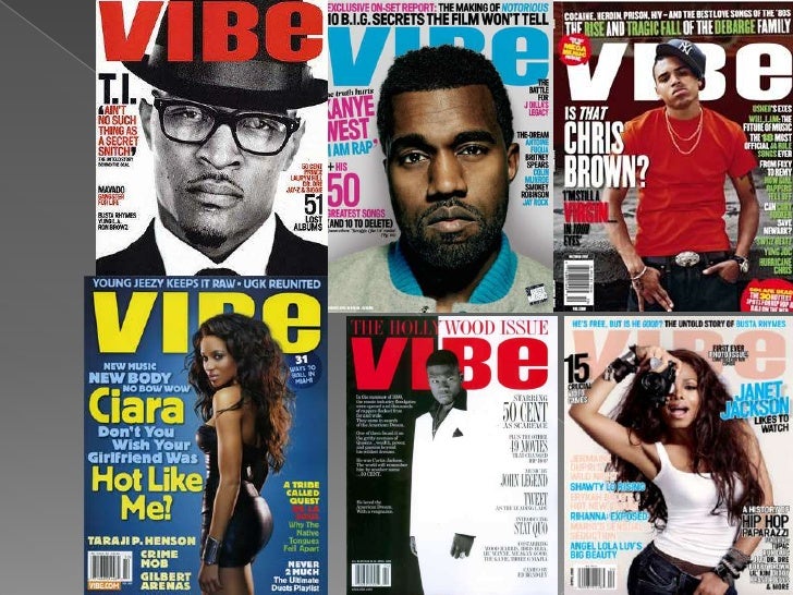
- My magazine uses one primary colour scheme, that of 'black and yellow', this is both opposed to and in cohesion with default colour schemes of dance magazines.
- Eventhough the examples show a clear two or three colour arrangement, on the inside their are often multiple use of other colours. This however is disimilar to mine as I continue the theme of black and yellow throughout
- My front cover is in keeping with that of dance front covers, this is clearly evident as the main format is to have a one person main clsoe-up image with text flowing around. I have done this as I have used a one person main image, capturing from the shoulders upwards.
- My masthead is also like that of the genre in relation to my media product. My title is named 'POWER' in complete bold text, this is much like 'VIBE', one name but it is bold explosive and catchy
2. How does your media product represent particular social groups?
- My magazine is predominantly aimed towards adolescents and young adults, but to retain a friendly appeal my magazine is open to all fans of dance music.
- My feature artist 'Darwin' is an edgy character who has a certain arrogance and rebllious side, but at the same time is porductive and creative as he is knon for making the best newest house music.
- Using Darwin is representative of young people, or is an impiled icon for young people as he is supposed to be a overall symbol first and for most for youth in modern times, as he is active and bold. But he is also used to be an inspirational character and to be a sort of boost for youth in relation to productivity and expressing yourself positively.
- I used this particular genre for Darwin as dance or more specifically 'house' is a major genre in terms of popularity for young people, therefore the intention was that young people would be more engaged and interested in my magazine, for what is represents and for what it offers and a personal release.
- My main feature article has an upbeat feel to it, as like the style of music it's supposed to be lively but and welcoming at the same time. The main purpose for this magazine on the whole is to be a release for young people, away from any hostility and issues that may be surrounded. A place were you view in order to have fun and focus on nothing else but being up to dated with all the latest news in the world of house music.
3. What kind of instituion might distribute our media product and why?
- I believe the 'Bauer' media group would be most suitible to distributing my magazine.
- 'Bauer' is one of the biggest magazine distributors in the world, they reach a very wide audience in all their magazine stlyes. They distribute from content from music to lifestyle, in relation to my project, magazines such as 'Q', 'Kerrang', and 'Mojo', fall under Bauer ownership.
- Distributing 3 of the largest music magazines shows that they are respected, trusted and shows most importantly that they generate a larger income.
- Eventhough not specifically music related, Bauer distributes to any age and for almost any subject, whether that be current affairs, gardening, sport or even to vintage cars. These other subject matters aren't related to my own magazine, but even so, this at least means a very varied audience will be attract and therefore will or should at some point come across my magazine even if looking for something else.
- In order to distribute my magazine effectively and efficiently, I would want to release my magazine in the form of new social media. This means methods such as an app, and various social media accounts like twitter and facebook.
- By doing this, magazine should appeal to people of a younger generation keeping my company seemingly active and up to date with the modern world.
Tuesday 24 February 2015
Friday 20 February 2015


Saturday 7 February 2015
Feedback 2
This week I took 5 photos of my magazine from the computer on my mobile phone. I took these photos home and showed them to my parents and a few friends, this was the feedback I gathered.
Feedback from Parents:
Mum: "Ross' new magazine design is very different from his original idea. I believe that the changes he has made are made for the better as there is a new found dynamism in his work, whereas before his ideas were good but fairly plain. The only criticism I would make is that all his images are very similar and aren't too eye catching."
Dad: "I like Ross' new magazine design. In all fairness I from what I remember him saying I preferred his original idea but I do think that this final magazine he will use is of a high standard. When speaking to him about this, Ross said his first colour scheme consisted of mostly of blue, and obviously in comparison this colour scheme is much opposed. But I do like this colour scheme of yellow and black, rather than the idea of blue. I do think his imaging is too the same and needs to be changed."
Feedback from Friends:
Friend 1: "His magazine is very decent. I'm not too sure on the colour scheme of black and yellow, personally I would change to red and white. I do however like his text style and use of font as they are quite easy on the eye and don't pose a harsh or harsher feel. I spoke to Ross' mum about his magazine and we both agreed that he imaging is far too similar. Ross has asked me if I could be used as a model in a photoshoot. I am more than happy help and will try and make sure Ross gets some decent images for his magazine."
Friend 2: " The last time Ross showed me his magazine ideas and told me what he would like to do was quite a while ago. From what I remember, his design has changed drastically. Most notably he has changed the colour scheme and images. I take media at A-level also, we have to carry out the same task as well, and in comparison to mine I would say Ross' is much better than mine and a lot more developed. If Ross uses this idea well, I reckon he can receive high marks."
Friday 6 February 2015
Thursday 5 February 2015
Tuesday 20 January 2015
Friday 9 January 2015
Subscribe to:
Posts (Atom)