This week I have been contemplating names for my magazine and artist names for the main article artist.
Name of magazine:
For the name of the magazine I had 3 main ideas: POWER, Spark, Radio Rental. I chose "Power" for the name of my magazine, with this name in mind I did play with idea of adding "The" at the beginning of the word "POWER" but after having time to think I chose not to do this, this is as the word "POWER" alone is more bold and clear. Plus, using only one word is more likely to stick with people and be more remembered. Other magazines have done this before and have become very successful, such as "Vibe", "Kerrang" and "Clash".
Name of main article artist:
For the artist name I also had main ideas, after cutting down a few names I came down to two main ones: Darwin and Rambo. In the end I chose "Darwin", I chose this name as even though "Rambo" sounds quite tough and fierce, I chose "Darwin" in connection to Charles Darwin. I did this to make it seem, or give the impression that this artist in the main article is a pioneer/revolutionary figure in relation to new music, much like Charles Darwin to the theory of evolution.
Friday 31 October 2014
Wednesday 22 October 2014
Wednesday 15 October 2014
Saturday 11 October 2014
Friday 10 October 2014
Production Diary 5
This week I've been looking at music videos trying to identify which ones I think have really good styles for me to use for my music magazine. Whether that be the use of text or possible shots I could use for the photoshoot. Whilst looking through music videos I found one particular video in which I thought was especially apparent when looking at shots for my photoshoot. This music video was "Thank You" by Busta Rhymes. The video uses a certain shadowed effect, this effect made me consider using this style for my music photoshoot, for the main article story inside the magazine. Eventhough I want to use bright colours for the front cover, I think contrasting the colours for different sections of the magazine creates a unique style, which inturn will hopefully make my magazine stand and have a different feel.
https://www.youtube.com/watch?v=QhIrzbhEGvs- This is the link to the video.
Some shots used in the video:

As mentioned these shots have a certain shadowed effect, alongside coloured lighting. These effects make the rappers in the shot more prominent and bold. Further, a new perspective is given to the people in the video unlike most music videos where the people are usually seen in just one light, which is standard and uninventive.
https://www.youtube.com/watch?v=QhIrzbhEGvs- This is the link to the video.
Some shots used in the video:
As mentioned these shots have a certain shadowed effect, alongside coloured lighting. These effects make the rappers in the shot more prominent and bold. Further, a new perspective is given to the people in the video unlike most music videos where the people are usually seen in just one light, which is standard and uninventive.
Thursday 9 October 2014
Monday 6 October 2014
Production Diary 4
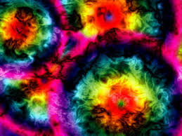
Like I wrote in my previous production diary I shall be making a post in the near future with scanned designs on there with a step-by-step walk through of colour schemes I am going to use, the style of magazine, type of font and so on. In this production diary I have chosen to display the colour style I intend to use for my music magazine. For the type of colour style I am planning to use I am going to use a psychedelic theme. With a mix of bright colours the magazine with become more enticing, and more pleasant to look at. Further, this particular design differs from the norm of magazine production, which in turn should also make the readers more engaged as it is unusual, giving the magazine a different feel.
Psychedelic Colours:
Psychedelic Colours:


Saturday 4 October 2014
Production Diary 3
So far I have uploaded my contents page and front cover for my haydon school magazine, I have also uploaded analysis for contents pages and front covers, I've presented this analysis through powerpoint in order to make it clearer for onlookers, whilst at the same time showing my intentions for the design of my music magazine. I now must start the plans for my music magazine, I will draw plans for my design, scan them and then upload them onto my one of my next posts . For my design I intend to use a fairly bright colour scheme, alongside very bold but yet minimal text.
I have been searching for different styled font in which I could potentially use for my music magazine. I have chosen 3 styles that I particularly like, these styles include:
 Pacifico.
 Lobster.
 Amatic.
I have chosen these 3 styles as possible font choices as they have a unique style to them which stands out from the rest of the other fonts. By using a unique style, the reader is more inclined to want to read on as there is a new concept that hasn't been seen before. Eventhough I previously mentioned in this post I want to use bold font, I have chosen the bottom one as it is similar to everyday handwriting, this can mean it's more realteable to the readers.
I have been searching for different styled font in which I could potentially use for my music magazine. I have chosen 3 styles that I particularly like, these styles include:
I have chosen these 3 styles as possible font choices as they have a unique style to them which stands out from the rest of the other fonts. By using a unique style, the reader is more inclined to want to read on as there is a new concept that hasn't been seen before. Eventhough I previously mentioned in this post I want to use bold font, I have chosen the bottom one as it is similar to everyday handwriting, this can mean it's more realteable to the readers.
Subscribe to:
Posts (Atom)